Tuesday, 14 March 2017

Magazine Advert - Final Version

This is the final version of my magazine advert for Bishop Briggs' self-titled album.

In my previous post this advert looked different; the following changes - the opacity and the colour of the Capricorn icon, the font colour becoming black, and the iTunes logo changing completely - have been made at the advice of my teacher, who says the previous edit made the appearance of the magazine seem "slightly off". 

The choice to make the font black emphasizes to the audience that this album is self-titled, and puts the focus on advertising Briggs. 
Since the font became black, the Capricorn had to become white to create contrast. While this is the reverse of the DigiPak, it still uses the same design and colours and therefore still links clearly back. 
I chose to make the white slightly translucent as it connotes a sense of fading; it's almost ghostly. I liked the way that this linked back to the themes of memories in my music video, in that it reflects how things can fade over time, but that they never truly vanish. 

Monday, 13 March 2017

Magazine Advert - Development

Having designed the DigiPak cover, I knew the style and appearance that I was going for with the magazine advert. 
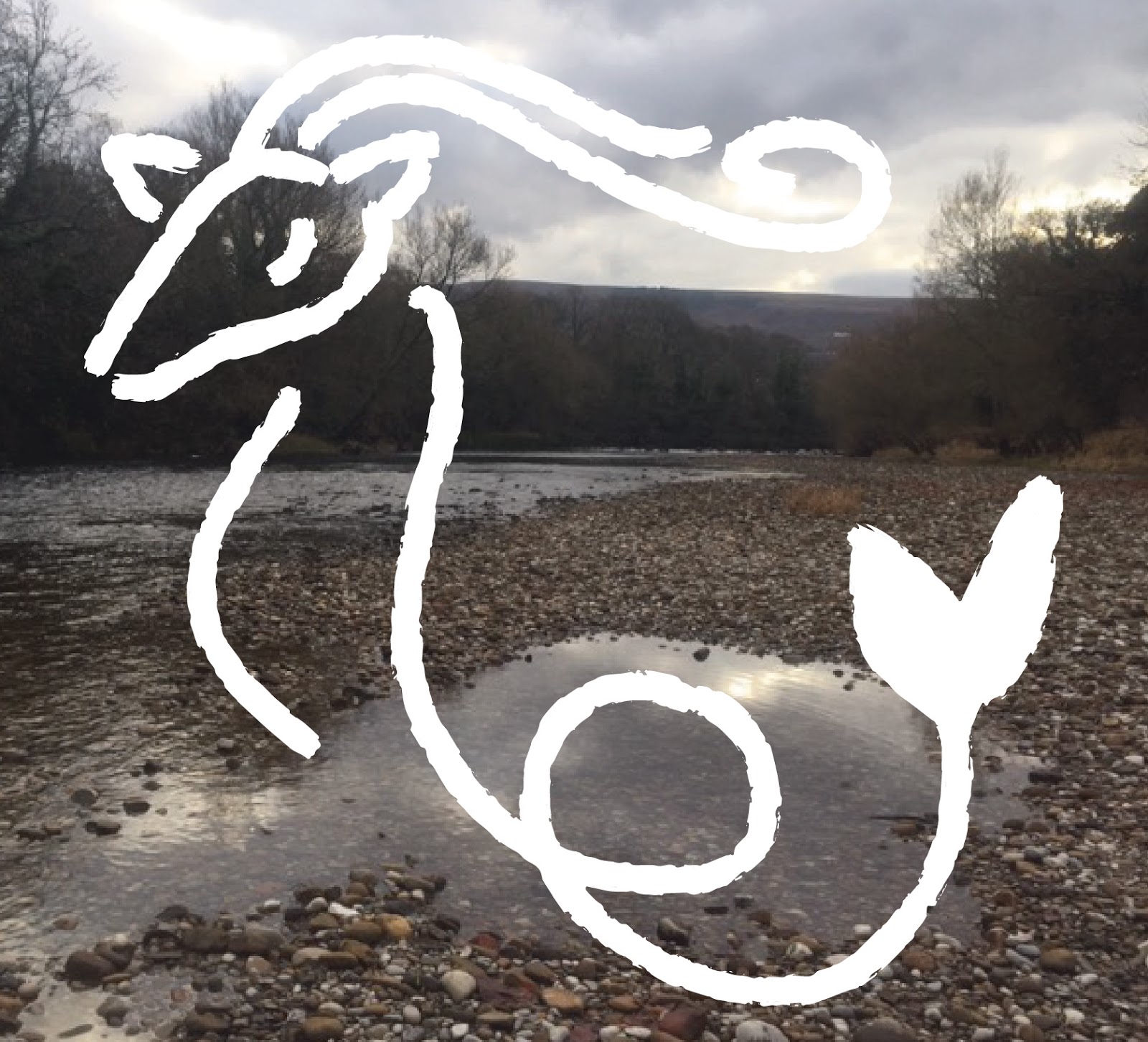
Using Adobe Illustrator, I opened a new document, inserted the water colour version of the river picture that I used for the DigiPak's front cover, and made a clipping mask so that I could correctly resize the picture to fit the portrait layout of a magazine advert. 
I then used the vector of the Capricorn Icon that I had saved, and opened it in the same document. I resized it without the changing its proportions (by holding down the shift key.) At this point I had the opacity set to 70%, as I liked the blended effect that this created.
As I had done with the DigiPak, I used the font Trattatello in white, as it faded nicely with the background but was still clear and seeable. It also created a striking contrast between the artist's name and the icon, which is more eye-catching. 


I decided to enhance this contrast by changing the opacity back to 100%, which made it far more striking. (My decision to change the contrast of the icon caused me to change the opacity of the icon on the DigiPak cover as well, as the ancillary products must follow the same artistic decisions so that the overall product - the singer - is presented in a consistent and professional manner.) 

I'd already decided on how I wished to layout my magazine advert (for example, with centre alignment) and what information I wished to include in it, as I'd explored this in my magazine advert ideas post.
The only changes I made were to the font (which became Trattatello), and some very minor size and placement adjustments. 
I changed the colour of the link to Brigg's website, as it was more seeable in black than it was in white, and I removed the "Available at" from above the iTunes logo and placed iTunes.com beneath it instead as this made for neater formatting. 


And so, pictured below, is what I would like to be the finalised version of my magazine advert. It's minimalistic in its information, but it does display all the necessary informational conventions of a magazine advert, contains links to the music video (i.e. the watercolour is of the river where the opening and ending scenes take place,) and is centred around the defining iconography of my artist, the Capricorn icon.


Saturday, 11 March 2017

DigiPak - Audience Feedback

Create your own user feedback survey

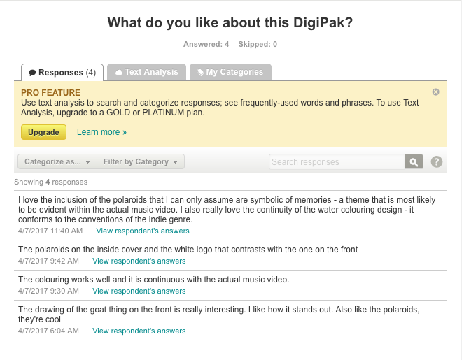
The DigiPak is clearly a success in drawing attention as 100% of responders said that it caught their eye.

This is a particularly important result as it shows that the DigiPak is appropriate to the genre and that it conforms to the conventions. 

The positive feedback is always uplifting to receive.

I've chosen to reject these two suggestions as the lack of a title is done specifically so as to create intrigue, while the island records logo isn't needed on the spine as it's featured on the back. 
From this feedback I can conclude that my DigiPak successfully serves its purpose, and that it is received well by the audience.

Friday, 10 March 2017

DigiPak - Final Version

This is my completed DigiPak for Bishop Briggs' self-titled album. 

DigiPak - Development

Having experimented with Adobe Illustrator and having carefully considered about the way in which I wanted to design my DigiPak, it was time to actually get to work and create it. 

The first thing I did was to email myself the Capricorn icon that I designed on my iPad's Sketches app. This allowed me to access it from the school's MacBook, where I opened the image in Illustrator, so that I could trace the image and turn it into a vector, allowing me to easily resize and recolour it.


Once this had been done, I removed its white background. 
I then selected a digital photograph I'd taken of Ilkley river and opened it in Illustrator, where I changed the colour of the Capricorn icon to white and placed it over the top. 


However, right away I realised that the two were rather incongruous to one another. Given the softness in the design of the Capricorn logo, I decided to experiment with the photograph. Using the Waterlogue app, I was able to see it in a watercolour style; I was very pleased with the result, and have used it as the back ground for both the front and back cover of the DigiPak. 
To fit the image to the DigiPak, I used the shape tool to create a rectangle shape measured from the outer lines, resized the image to fit the rectangle as best as possible while holding down the shift key, and then selected it all and made a clipping mask, which I was able to place over the front/back cover.

Initially, I tried it with the water colour image and Capricorn icon only being on the front cover. However, the effect of this was that the back cover felt like an entirely separate entity. Due to this, I decided to use the image the whole way across the DigiPak's front and back cover, as it made it feel connected.  

I'd already created the track listings, the legal jargon, the barcode and the Island Records logo in my rough draft of a DigiPak, so I reused them. The only changes made were a slight shift in formatting (although not to a noticeable degree), and the different font. While I had considered a few alternate fonts, the one that won out was Trattatello, as it was the one that simultaneously looked the most professional and yet still maintained that 'human element' to it (it looks like it could be handwriting.) 

For the inside of the DigiPak I wanted to create the effect of it as being almost like a diary or journal of sorts, which relates to the theme of memories explored within my music video. It also presented me with the opportunity to take some polaroid photography; I took pictures different things that I felt were related to the music video (such as the subject herself), scanned them into the computer, and digitally placed them over the parchment paper background that I created. 

To create the parchment paper background without reducing the quality of the image I doubled the image and reflected it, giving it the appearance of being one long image that I was then able to make a clipping mask out of.

As I'm producing this as a self-titled album, I placed Briggs' name in the centre of the spine, in a white print so that it would stand out against the dark coloured background.

Once I had placed the background my next job was to fill it in, which I did using the Polaroid photos I had taken; the subjects of each photograph relate to the music video. I scanned the polaroids into the computer and then opened them in Illustrator. I decided that instead of flipping each image individually, I would instead arrange the images, make a clipping mask to ensure that they fit to the inner panel, and then group and flip it all. 


(The distorted lines around the edge of the photographs will disappear after the document is exported.) 
At this point I felt I was done, so I asked my classmates and teacher for some informal feedback on what they thought of it; this was when my teacher raised the point - that was quickly agreed upon by my peers - that the inside cover (behind where the CD would be placed) felt too empty. This lead me to the idea of placing the Capricorn logo on the inside as well, except I changed it up this time. I decided to decrease the opacity and make the colour white, so that it looked like a watermark and fit with the papyrus paper background. 


With this, the DigiPak was complete!


It follows the necessary codes and conventions of a DigiPak, it's fitting to the genre, it contains iconography for the artist and links to the video and the magazine advert. 

Thursday, 9 March 2017

My Music Video - Version 2

This is the second finalised version of my A2 coursework music video for Bishop Briggs' song "River."
 

This edit is almost exactly the same as the first version in terms of shot ordering, (with the one exception of the aerial shot of Cayman from the plane window, which has been extended in this edit. It takes place at 2:13, and lasts till 2:15. To accommodate this lengthening, I removed a 1 second clip of the subject in front of a palm tree projection.)

The difference in this version to the previous version is the colour balancing; the previous version had not been adjusted, but in this version I have used the FinalCut Pro preset tool to colour balance each clip. To do this, first you must select the clip you want, then click on the Enhancements Menu which will produce a drop down box with the 'Colour Balance' option.

This will automatically balance the colours within the shot, giving the footage an appearance of being more cinematic. 

While I edited the majority of the video, I didn't use colour balance on every shot; I ultimately left the shots of my subject in front of the concert projections untouched, as I found that when I attempted to colour balance these - due to how dark they are -  the footage became lower quality and grainy. Besides, I felt they didn't really need it, as my manipulation of light with the projections put them outside the normal parameters for things that need colour balancing. 

I'm glad that I have colour balanced the footage, as I have found that the overall effect is that it does indeed make the footage seem more 'natural' (like if we were watching these events with our own eyes, and not through a camera.) 

Sunday, 26 February 2017

My Music Video - Version 1 Audience Feedback

I asked for audience feedback on this first finalised version of my music video by sending it to my friends via WhatsApp, posting it on Facebook, and by enabling the comments section on Youtube.
I chose to seek audience feedback from my peers as they are representative of the audience demographic that I was targeting with my music video.

Above are the replies from three 18 year
old females. Two are Caucasian and
one is Afro-Caribbean; all three are
long-residents of the Cayman
Islands.
Sam Hadfield, 18 year old Caucasian British male. He went on to raise an interesting point regarding the ordering of some of the shots, which I am now going to review in light of his comments.
A YouTube comment that my video received. The channel appears to be a promoter of copy-right free music (but the compliment is still very much appreciated.)

Maya Ambekar, 17 year old Indian-Caucasian British Female.


With this feedback I am able to happily confirm that my video has successfully appealed to the demographic I was targeting. I also plan to address any questions the audience have, and will consider the suggestions made.

I posted a link to the video and a request for feedback to my personal Facebook page, in the hopes of gaining feedback from my peers. 

Charlotte Upham is a 17 year old A2 media student who recently moved to the UK from Dubai. I have made a careful note of her point about the transition from England to Cayman (something raised by Sam Hadfield as well), and will be revising the video, seeing if I can make the transition clearer in any way.