Showing posts with label Initial Ideas. Show all posts

Saturday, 18 February 2017

Magazine Advert - Ideas

Based on my research into the codes and conventions of magazine ads for albums, I know that the magazine ad is essentially a variation on the album/DigiPak cover.
As I intend for my advert to follow these conventions, I will be basing my magazine advert off of whatever my final DigiPak cover looks like.

In all likelihood, I will be using my own design of the Capricorn icon - as it appears on the front of the DigiPak.
Keeping in form with the DigiPak, I plan to also use the same parchment paper background (of course I will need to see how it looks in actuality before I finalise any decisions.) 

I reckon that I'll probably stick with the layout of my draft magazine advert (pictured below), as it contains all the necessary information and clearly identifies what the advert is about, without losing the striking simplicity.

As I've already considered with the DigiPak, I plan to explore using one of the fonts below for all the typography featured in the advert (with the exclusion of the record label logo, the artists website address, and the iTunes logo/website.) The font I ultimately choose will of course be the same font that I use for the final DigiPak.
This font is the most similar to the brush with which I created the Capricorn drawing. I'm inclined to use it, save for the possibly juvenile feeling it creates. I will be showing three edits - one with each font - to members of my target audience to gain feedback and opinions to help me make a final decision.  
This font has the same uneven edges, but in a slightly more toned down version making it less juvenile looking. However, I'm not sure if the thinness makes it feels too clean/simple. 
  
I think this one is my personal favourite. It's style makes it feel as if it's been carefully handwritten, and it looks good in lower-case and upper-case letters.


At this stage I can't decide anything else, but I am now ready to begin bringing my ideas to life with Photoshop and Illustrator.

Friday, 17 February 2017

DigiPak - Ideas

During my initial exploration of creating a Digipak I managed to create a rough draft for a DigiPak that I intend to use as a starting point to work with as I develop my ideas further.


I'm very fond of having the Capricorn image on the front of the album, especially as it's the key piece of iconography I've decided to associate with my artist. The simplicity is also bold and eye-catching, which is useful in making sure it's memorable and distinctive to fans. 
However, the extreme simplicity of it doesn't link to the style of the music video I have created, nor does it feel appropriate to Briggs' alternative genre music. 
Given this, one idea that i've had to make it more appropriate is to use photoshop to create some sort of combination of the Capricorn logo mixed with a photograph - possibly one of the river - to have the effect of the Capricorn being filled in by this 'memory' (as this video does.) 

Another idea that I toyed with was drawing my own original Capricorn logo. 
To create this image I used the Sketches app on my iPad. I googled images of the Capricorn symbol and had a go sketching it out, experimenting with the different tools on offer. The above drawing was the most pleasing result. 
The softness of the design - an effect created through the uneven looking edges of the drawing - is more appropriate to the genre than the vector Capricorn I originally used. The soft curves of the lines and the slightly heart shaped tail also connote a femininity to the design, which fits with the fact that the singer is female and the video is supposed to be from her point of view. 

I also had the idea of incorporating polaroid shots into the DigiPak.
One way of formatting this could be to have a picture of a range of polaroids spread over a plain background (e.g. a wooden desk), possibly lit with candle light, maybe spread around a diary featuring the above sketch. 
I'm considering using this idea as the image for the inside covers of the Digipak.

An example of a polaroid I'd use. I think I'd play with the focus so that the polaroid's were out of focus, with the drawing of the Capricorn perhaps out of focus as well. I quite like the idea of handwriting some of the lyrics of the song on the open page, next to the drawing, and having the focus on them.
I think I'd still leave the back panel of the DigiPak to be a plain, solid colour, featuring only track listings and legal info, but obviously with the colour matching that of what's on the front.
I think I may go for a light coloured background instead, as this brings a softer feel to the product as a whole. I'm going to explore have a pale background that looks like fancy, cream-coloured paper, as this can be linked to the idea of memories. 
In regards to font, given the my ideas about drawing the Capricorn icon and handwriting the lyrics, I intend to use a font that looks (maybe even is) handwritten, in a dark colour so as to stand out against the pale background. 


Using the iMac app font book, I discovered the above three fonts - all of which I will experiment with during the creation of the DigPak.
The style of all these fonts feels congruous with my Capricorn icon drawing, so it will simply be a matter of deciding which one looks best.

I'm hoping that the overall effect of these ideas will be that I am able to produce a DigiPak that is much more fitting to the music and the music video, and that conveys a very personal feeling to the audience - like looking at a scrap book.

Saturday, 4 February 2017

Magazine Advert - First Stages


As part of my A2 coursework, I have been tasked with creating a Magazine Advert for my chosen artist.
To do this, I'm again going to be using the programme Adobe Illustrator CS6.

As I've done my research and analysis into the codes and conventions of magazine adverts, and as I've already begun to dabble with album cover ideas for DigiPak, I had a enough of an idea for my own advert to begin an initial exploration. 

So, the first thing I did was to open a new document in Adobe Illustrator CS6, and place a black rectangle shape over the page. This gave me a base to work off of, and matched the choice I made for the black background on the front and back covers of the DigiPak.
As I'd already worked with Illustrator, I conveniently had all the vectors I'd previously used readily available me, so when I decided to recreate the appearance of the album cover, all I had to do was select the previously downloaded images, such as the capricorn vector and the island records logo vector. 

Due to the importance of making the magazine advert congruous with the the DigiPak, I chose to use the same font - Lucida Blackletter - that I used on the DigiPak on the advert. I created a text box using the text box tool, and then I placed the artists name, "Bishop Briggs" in large at the top centre of the page, in line with the horns of the capricorn vector I placed below. 
At an equal distance of spacing beneath the capricorn, I decided to place a review/rating of the album (taken from a real review). I created another text box and then chose a smaller size for this, as people will be more intrigued as to what the smaller writing says and will therefore pay attention when reading it. 
Like I did with the DigiPak - and as I've noticed it as a convention of numerous other album magazine adverts - I placed the record company logo in the bottom right hand corner. I'd already downloaded it as a vector before, so all I had to do was open it as new and then change its colour to white (so that it would show up against the black background.) 

At this point it still felt rather lacking as a magazine advert, so I looked at my list of magazine advert conventions and decided to add a release date, information about where the album is available, and Bishop Briggs' website address.

To get the right look for the website address I tried placing a screenshot of the actual address so that I could have the fancy "B" symbol it uses at the start. However, I was dissatisfied with how this look, so I instead typed out the web address using Lucida Blackletter for the "B" (the closest font I could find) and Arial for the address. This provided me with a similar enough look and avoided me having to use a screenshot. 

This is the screenshot of the actual website address
This is my recreated version of the website address
To advertise where the album is available I decided to download the vector for iTunes (granted, it's not the most recent logo, but it'll do for this practice run.) 
I then opened it in Illustrator and placed it in the bottom left hand corner of the advert, opposite and aligned with the Island Records logo.


I wasn't quite finished yet though, as the iTunes logo by itself - while the message would've been clear enough - felt a bit unfinished.
So I typed "Available at" and "iTunes.com" and placed them above and to the right of the logo.
Admittedly, this looks odd. But for now in this trial it'll do.

Overall, by this point the advert was definitely looking more appropriate.


Still very simplistic in terms of the visual design, but as I'd included enough of the codes and conventions to make it clear what I was advertising, I decided to conclude my trial here.

*************
In conclusion, as a first attempt I am satisfied with the results. I like the simplicity of the capricorn logo and definitely intend to keep using it; however, I do think the design may be too clean for the genre. I'm planning to try working with photoshop to incorporate some photography in the design, possibly using the frame of the capricorn...
But we shall see!

Friday, 20 January 2017

DigiPak - First Stages

As part of my A2 coursework, I have been tasked with creating a DigiPak for my chosen artist.
To do this, I'm using the programme Adobe Illustrator CS6.
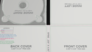
I started by downloading a DigiPak template (I chose the "4 Panel 1 Tray (4PAN1T)") and opening it Illustrator. This template comes 'locked' (meaning it cannot be changed), so I first went to the layers feature, unlocked it, deleted the unwanted information (such as writing) from the template and then locked it again (to avoid accidentally reformatting it).


Once I had a clear template, I placed a square shape (using the shape tool) and matched it to the bleed line; I then set the colour of the shape to a black fill, and removed its border lines, giving me a black background base to work with.
To make sure I could still see the remaining template lines over the black, I went into the layers feature and dragged the template layer to the top, as this makes it visible over the other layers.


As this is only a practice DigiPak I didn't worry too much about finding the perfect font, and chose to use the Lucida Blackletter font for the title and American Typewriter in white for the track listings on the back (as these are fairly similar to fonts used for Briggs' actual album covers.)

I chose to number my track listings and to place them to the left side on the back cover of the DigiPak, as this is a common decision for DigiPak layouts and as I wanted to keep this design fairly simple. To the bottom left I placed the copyright jargon (which I typed out myself, copying an example found online), and to the bottom right corner I placed the barcode (which I downloaded as a vector), with the Island Records' logo positioned above it.
To place the logo, I had to download it as a vector, then opened it in Illustrator. Following this, I ungrouped the image, deleting its background and regrouping it. I then changed its colour to white so that it would be visible against my chosen black background. I then resized it (while holding down 'shift' so that I could resize it without reshaping it), and dragged it to where I wanted it to be positioned.


For the inside of this trial DigiPak, I decided to place a still from the opening shot of my music video (an extreme long shot where the subject stands by the river) over both the panels. As the shot has the subject on the right hand side of the frame, I reflected the image so that the subject would instead be on the left (so she wouldn't be covered by the CD on the left panel.) 


I used a clipping mask to get the correct shape picture for the cover, by first drawing the shape of the bleed lines, and then placing the shape over the image to clip it, before putting the image in place.

It was at this point that I realised I was unhappy with the appearance of my DigiPak's front cover, so I decided to try out an idea; I went online and searched for vector's of the Capricorn sign, and then downloaded my favourite one so that I could use it as an image on the front cover. When I placed it on the front cover, I liked it so much that I decided to forgo having an album title, and to just let the image of the capricorn do the talking. 

This is the final edit of my trial DigiPak. I'm a big fan of the simplicity of the image of the Capricorn, but I do plan on changing the fonts, and I'll definitely play more with the image on the inside.

*****************
As a first attempt at using the Adobe Illustrator programme I am glad to say I'm pleased with the results, and that I found this programme fun and relatively user-friendly (even for me and my generally poor luck when it comes to tech stuff!) 
I look forward to exploring more, and I'm excited to see what other available features there are and how I can use these in the development of my DigiPak.

Saturday, 14 January 2017

My Music Video - Test Footage 5


During the shoot in which the subject gets ready for the concert, I took several practice runs of the sequence of event with my actress, so as to familiarise her with the routine and so that I could test angles, lighting, and depth of field/focus.
The footage above is the example of some of the test footage that I took before we filmed properly.

The test footage was very helpful for allowing me to smooth at the wrinkles, allowing me to avoid a situation where I would review the footage only to realise I'd need to call my actress back to film more, (something of which I have been guilty of in the past.)

Thursday, 29 December 2016

My Music Video - Test Footage 4

The footage that I'm gathering in Cayman is a combination of GoPro and iPhone gootage. I have personally filmed all of it, with the exception of the underwater GoPro footage in which I am featured with my sister; this was filmed by my brother, but I liked the footage so much that I asked for his permission to use it within the video.


There is still some footage that I'm yet to obtain, but thus far I am happy with what I'm producing. The unedited test footage above is an example of what I so far have.

Sunday, 4 December 2016

My Music Video - Test Footage 3


The above footage was taken as test footage during yesterday's shoot in the projection room and at school. 
Whereas the footage taken at school was relatively straightforward to film, although I will have to film more projection scenes as I've not yet got all the projection footage (some of it is yet to be filmed as it's planned for when I return to Cayman in December).
The river filming was considerably more tricky to set up. There were several challenges, such as finding an even surface on which to place the camera, and a part of the river at which to set the boat adrift. 

However, despite these few difficulties, I am satisfied with the result of the majority of the footage.

Sunday, 27 November 2016

My Music Video - Test Footage 2

Below is some sample footage taken from yesterday's shoot, in which I used a GoPro to capture the subject's point of view shots.
This footage was taken before the GoPro died, which resulted in me having to use my iPhone to film with instead.
It was actually as a very good thing that this happened, as when I reviewed this GoPro footage later, I found that the angle was wrong (meaning my hands had been almost completely missed in every shot) and that the footage was uncomfortably shaky and unsteady. 


In contrast to this, the iPhone footage was by far superior,  so I will be using that in the video instead. 

Wednesday, 2 November 2016

My Music Video - Locations

Due to the subject of my music video being an abstract exploration of memories, its needless to say that the range of locations is going to be vast.

Already, I have filmed the scenes needed for the concert, which of course was done at the location of the actual concert, the O2 Academy in Leeds.


Another location that will be featured heavily within the music video is Ilkley river. I very much planned the opening and closing sections with the river in mind, although I did have to spend an hour or so walking up and down to find an appropriate spot of the river at which to film.


The left image was a point I had considered filming from, but when it came down to practicality I found it would not have been possible to obtain the shots that I required. The above image is at a point slightly further down the river, and on the opposite bank; this part of the river (at low tide) proved far more appropriate for filming.

For the scenes in which the subject gets ready for the concert, I chose to film in my own bedroom, as the mise-en-scene was already conveniently set up to connote a teenaged/young adult female's living space.
While the majority of my room was left alone, I did rearrange the set up of this corner (which usually has a bean bag chair in it) so as to be able to display the record player and the collage of personal affects on the wall.

To film the projections I intend to use one of the school photography rooms, as it has blackout blinds and a white background onto which I want to project the 'memories'.
In regards to the memories footage itself, it's going to have to be acquired throughout a range of locations within the Ilkley/Addingham area and from places in Grand Cayman (I've made the decision to include footage from Cayman so as to give the video a unique twist, in the way of mixing two significantly different landscapes). I have a few ideas on where/what I will shoot, such as in my own back garden, but I'm planning that the majority of the footage will end up being spontaneous. 

My back garden in Grand Cayman (home). 

My Music Video - Concept Inspiration & Influences

I knew from the very start of this project that I wanted my music video to be related to the 'teenage experience', so it was only natural that the inspiration for what footage to include in my music video would stem from my personal experience. 
For example, the concert footage was acquired from a rock show I attended, and while I have changed the specifics of that night, what I want to portray are the feelings - the excitement of concerts, the emotions of being a teenager, and the experience of having an intimate connection with someone. 
The 'River Scene' is meant to symbolise the subject's appreciation of these memories and her acceptance in moving forwards in life (which is represented by the river), with the stick figure in the paper boat being a simplistic and innocently childish representation of her doing so. 

In terms of the actual style of the video, part of my inspiration came from the music video for Wild Belle's song "Backslider"

I admired the way in which the lighting was used, making it more of an art piece than a music video; I became excited by the idea of being able to use projections to make a more abstract, artistically free video. 

I was also inspired by the music video for Wild Belle's other song "Our Love Will Survive". I was particularly fond of the effect that was placed over the footage to make it seem like old film with faded colours - it had a softness, making the overall feeling really intimate. This intimacy is exactly what I want to capture and portray in my music video, and I think that a similar filter over my own footage will be very effective in achieving this. 


(Above and to the left: screenshots from Wild Belle's music video "Our Love Will Survive". These screenshots demonstrate the filter effect.)


Another idea with which I had played since the beginning was creating obscurity over the artist's identity, which performers such as Deadmau5, Sia, and Daft Punk are known to do.

DeadMau5

Sia

Daft Punk
This lead me to consider ways in which I could obscure the identity of my performer. I knew I didn't want to present my performer as futuristic - the genre of the music is wrong for that - so initially, I considered plain, white plastic masks with humanoid features. I liked the idea of plain coloured masks because it left me open to the possibility of changing their colours within the video, (for example, with spray paint or glitter etc.)
However, one reservation that I hold towards a humanoid mask is that they show no emotion. While this can be beneficial for anonymity and generalising the subject to present her as 'anybody' (making it easier for the audience to connect with her, by allowing them to see themselves in her,) I feared the lack of emotion may send the wrong message to my audience. This lead me to consider the possibility of making her mask animalistic, as it is primal emotions that the music and my video explore, and an animal mask would create this raw, primal sense. 

I was encouraged with my idea of using an animal mask by the Orphan Black (the BBC America fiction-drama about clones) character known as M.K. 
In the show, M.K. is a social outcast living off the grid, who wears a sheep mask (which is a nod to Dolly the Sheep) to obscure her identity during her cryptic video posts and while she's on the run. As a character, she's isolated and scared of the world - I want to address these themes within my music video, as they're common things that all young people will feel at some point or other within their lives. I'm not certain yet as to what type of animal mask I'll use, but I would happily use a sheep mask in my music video, as an intertextual nod towards M.K. and her struggle.

M.K. as seen in her mask

In summary, my video has been influenced by various modern media products, both in terms of style and concept. There is also a significant influence by the genre of the song; after all, creating a music video that doesn't match the musical genre would be ineffective and most definitely disliked by audiences. 

Monday, 26 September 2016

My Music Video - Alternate Song Potentials

As there is a degree of risk when collaborating with a novice artist (which may result in complications that lead to failure to produce the song) I am considering as a back up option the song "Counting Stars" by One Republic.


The reason I am considering this song is because the lyrics have potential to link to the visuals (at least in relation to the themes and ideas of the song) and also as the fast pace of the song would pair nicely with what I envision my editing pace to be (fast and exciting to elicit an emotional response from the audience.)


I'm also considering the song "River" by Bishop Briggs. I feel that the mood of the song can tie in nicely with the concept of my music video.

Thursday, 15 September 2016

My Music Video - The Pitch

(Intending to use an original song composed in collaboration with Mike Galvin)

"Opening with extreme long shot of subject by river, watching it run. Cut to close up of her face, which is concealed by a mask - contemplative.
Cut to close up shot of her hands holding a paper boat.
Cut back to medium long shot of subject, looking down at river.
Fade to black.

Moment of silence/blackness.

Music starts and editing has multiple different extreme close ups of different parts of subject against a plain background appear, giving a flashing/strobe effect.

****

The pause before the lyrics shows a medium close up of the subject, standing still, looking into camera.

(cut together the rest of the footage as appropriate)


Film subject against green screen; staring at camera, dancing/spinning, watching action on green screen, looking at something off-camera in the distance


Go-pro Footage; street signs from a car window, riding bikes, climbing
trees, walking a dog, jumping into water, trampoline, bonfire, mosh pit at a concert, ru
nning for a train, building a fort, reading a book, playing a record, eating pizza with a group of friends, fairy lights and candles, drawing, baking

****
Song ends and it cuts back to medium long shot of subject by the river. Subject is still watching the water, but then she sighs, and floats the paper boat into the water.
Shot of paper boat floating away.
Medium close up of subject watching for a moment; she then goes to take off mask.
Low angle shot of mask falling to ground just in front of camera, and then her feet walking away. Back to starting shot position, extreme long shot of subject walking away (fade out of focus, to blackness.)


Iconography
As part of creating a brand for a singer, it's very useful to associate certain themes, ideas, behaviours or imagery with them, as it creates a memorable impression for the audience and therefore makes them easier to sell as a brand.
I've decided that I want the subject of my video to wear a mask, as this creates a narrative enigma as to who she is. It also adds a quirky sense of 'otherness' to her, which may further intrigue audiences. Most importantly however, the lyrics of the tell the story of someone who's about to enter a new stage of their life, who feels bound by expectations and uncertainties, and simply wants to live a great life and have fun despite these fears.
I'm still toying with the specifics of how the mask can help to symbolise all of this, but I plan to cover these ideas in more detail later on.
The idea of a plain coloured mask gives potential to add colour/paint to it during the music video

The simplistic geometric animal head masks are another possibility that intrigues me. 


This is the first pitch I made. 

Collectively, we were underprepared as a class (although I did feel that my own 13 minute pitch answered all the necessary questions and painted a clear picture of my vision), which meant we had to do another pitch .

This is the second pitch I made.

The second pitch was also given the green light by my teacher, so now begins the hard work!